Monday, December 25, 2006
Reason for the Season
Otherwise, Happy Holidays! The TD crew is in California for seasonal festivities, but will try to cover some red hot L.A. action. Otherwise, our brains will atrophy in NYC's younger, dumber coastal analogue. Perhaps the Baldessari-designed Magritte show at LACMA? Is Magritte still relevant? Of course, he is.

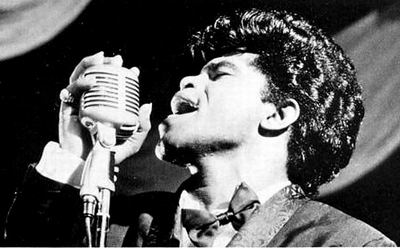
Not James Brown!
Wednesday, December 20, 2006
Happy Birthday, Elizabeth Peyton
Happy Birthday, Elizabeth Peyton! You are 41. But you still look great!

You are in the contemporary canon and no struggling artist's complaints about your skills (anyway, it's a deskilled age), scope of subjects (anyway, focused is as good as eclectic), and Hamptons-hopping (anyway, "the studio" is dead) will nudge you from the top tiers of stardom. We know that the fashion magazines spin you as more a dreamer than thinker - much like us - but we also know that your brand of shoegazer pop was culturally relevant in the late 1990s context of art meeting fashion, the cult of celebrity-worship and fabulosity, and in the context of youth-fetishizing art.

We met you once at a gallery and you were nice. Happy birthday!
Monday, December 18, 2006
Old and New Art

From today's NY Times article about Saatchi's new myspace site for artists:
"The diverse offerings have caught the eye of contemporary-art experts like Olivier Varenne, director of the Museum of Old and New Art being established in Tasmania, the island state of Australia."
We can't get enough of that name! Can the Met borrow it for a year? Also, are those separate departments? Is someone "Chief Curator of Old Art?" Is the "Director of New Art" his protege? Anyway, isn't "Old" a little un-P.C.? Triple Diesel recommends "historically endowed."
We think the Museum of Old and New Art has an old and new web site here.
Thursday, December 14, 2006
The Humphries Dance
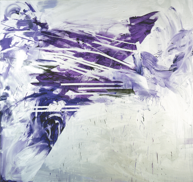
Jacqueline Humphries must hang out with Christopher Wool and his wife, Charlene von Heyl. The influence is obvious. Here is the tape that von Heyl flashed in her recent show at Petzel, along with the scrubbed, unpainted style that von Heyl swaps with Wool.
Charlene von Heyl pioneers gestural abstration, (aka AbEx), albeit atmospheric, slick, and programmatic; instead of heavy, crusty, and spontaneous. Although her paintings document a decision-making process - a record of thought - they also expose an architectural, plan-driven mode of thinking - appetitive but distilled. This is evident in the use of tape, because one can't apply tape in a gesture. Materially speaking, it takes a few minutes of care and measurement. Intellectually speaking, the voids left by the taped areas interrupt the gestural areas, revealing a sensibility that contests the primacy of gesture.


Christopher Wool's spray-painted abstraction is both renegade and ascetic, like a noir hitman bachelor of few words, or even Batman. Pared down to black and white, he withholds from himself and the viewer the sensual possibilities of painting: no emotive color, no bravado brushwork, no bold/audacious/libidinal/fucking rock star painting. Just spray paint, the tool of the graffiti artist, and drips or scrapes - which he uses more like litter or leftovers than Pollock-ian action. Wool's paintings are pared-down and nihilistic, aware of decline and degeneration.
While Wool brings home the bacon, von Heyl wears the painter's pants in the family. But both have vowed to challenge the gesture. CvH does it by negation, by physically interrupting the gestural stroke with non-gesturally applied tape and the consequent voids of action. Wool does it by revising the gesture as vandalistic and stoic, instead of romantic, action-packed, or pastorally sublime. Isolating and reimagining the gesture in order to review it, positively or negatively, is part of Rauschenberg's seminal "Factum I/II" diptych, Lichtenstein's frozen brushstroke sculptures, Siskind's "Homage to Franz Kline," Serra's cross-medium "Molten Lead" toss, Ann Craven's Bambi reincarnations, Warhol's impersonal grounds for divorcees, Richard Aldrich's scrutinized scribbles, and many others. Part of the subject matter are the appearance of and connotations of the Good Old American (or European) Gesture, which is supposedly spontaneous, willful, immediate, direct, and ungoverned.


So Jacqueline Humphries produces for her show at the excellent Greene Naftali gestural, scrubbed, taped abstractions in silver, even with some spraypaint. Hot off the series of "black light" paintings seen in New York at Nyehaus and Elizabeth Dee, JH continues to challenge the sufficiency of paint on canvas to transport the viewer and therefore, submits her palette and surface to unusual optical effects. The silver glistens and competes with the other colors. From ground to surface to material to subject, the silver dances and prances while bedazzling you to overstimulation.

These paintings are kinky, raunchy, and gauche. Imagine Marilyn Minter gone nonrepresentational. These works listen to Motley Crue, fuck you in fishnets, claw you with their black polished nails, and put out cigarettes on your nightstand. They would go down on you in the theater. The paint is slathered on, then scraped, scrubbed, and scratched in a fury. It pools in excessive puddles, then drips away, leaving eroded layers behind. Meditative restraint and sparse economy, employed by Joan Mitchell, have no place here. We're closer to Cecily Brown's libidinal relentlessness, where every inch of canvas seems battered. Yet that relentlessness is unlike the early AbEx painting, which was driven by an urgency netted by the subconscious flow. These are mannered and stylized. The masking tape masks, but with frequently irregular tapering and imprecise, leaking seams. So while the tape regulates, it is still a little reckless. Like a conspiring chaperone.

Charlene von Heyl pioneers gestural abstration, (aka AbEx), albeit atmospheric, slick, and programmatic; instead of heavy, crusty, and spontaneous. Although her paintings document a decision-making process - a record of thought - they also expose an architectural, plan-driven mode of thinking - appetitive but distilled. This is evident in the use of tape, because one can't apply tape in a gesture. Materially speaking, it takes a few minutes of care and measurement. Intellectually speaking, the voids left by the taped areas interrupt the gestural areas, revealing a sensibility that contests the primacy of gesture.

Christopher Wool's spray-painted abstraction is both renegade and ascetic, like a noir hitman bachelor of few words, or even Batman. Pared down to black and white, he withholds from himself and the viewer the sensual possibilities of painting: no emotive color, no bravado brushwork, no bold/audacious/libidinal/fucking rock star painting. Just spray paint, the tool of the graffiti artist, and drips or scrapes - which he uses more like litter or leftovers than Pollock-ian action. Wool's paintings are pared-down and nihilistic, aware of decline and degeneration.
While Wool brings home the bacon, von Heyl wears the painter's pants in the family. But both have vowed to challenge the gesture. CvH does it by negation, by physically interrupting the gestural stroke with non-gesturally applied tape and the consequent voids of action. Wool does it by revising the gesture as vandalistic and stoic, instead of romantic, action-packed, or pastorally sublime. Isolating and reimagining the gesture in order to review it, positively or negatively, is part of Rauschenberg's seminal "Factum I/II" diptych, Lichtenstein's frozen brushstroke sculptures, Siskind's "Homage to Franz Kline," Serra's cross-medium "Molten Lead" toss, Ann Craven's Bambi reincarnations, Warhol's impersonal grounds for divorcees, Richard Aldrich's scrutinized scribbles, and many others. Part of the subject matter are the appearance of and connotations of the Good Old American (or European) Gesture, which is supposedly spontaneous, willful, immediate, direct, and ungoverned.

So Jacqueline Humphries produces for her show at the excellent Greene Naftali gestural, scrubbed, taped abstractions in silver, even with some spraypaint. Hot off the series of "black light" paintings seen in New York at Nyehaus and Elizabeth Dee, JH continues to challenge the sufficiency of paint on canvas to transport the viewer and therefore, submits her palette and surface to unusual optical effects. The silver glistens and competes with the other colors. From ground to surface to material to subject, the silver dances and prances while bedazzling you to overstimulation.
These paintings are kinky, raunchy, and gauche. Imagine Marilyn Minter gone nonrepresentational. These works listen to Motley Crue, fuck you in fishnets, claw you with their black polished nails, and put out cigarettes on your nightstand. They would go down on you in the theater. The paint is slathered on, then scraped, scrubbed, and scratched in a fury. It pools in excessive puddles, then drips away, leaving eroded layers behind. Meditative restraint and sparse economy, employed by Joan Mitchell, have no place here. We're closer to Cecily Brown's libidinal relentlessness, where every inch of canvas seems battered. Yet that relentlessness is unlike the early AbEx painting, which was driven by an urgency netted by the subconscious flow. These are mannered and stylized. The masking tape masks, but with frequently irregular tapering and imprecise, leaking seams. So while the tape regulates, it is still a little reckless. Like a conspiring chaperone.
Wednesday, December 13, 2006
Dimensions Variable: Meaning Field Yields Meaning
The TD crew has a soft spot for craft and a hard-on for dematerialization. Readymade is so tired, modified readymade is a pick-me-up, but dematerialized or even invisible is intoxicating!
So we stumbled into Anton Kern's new Annex, formerly Andrew Kreps' space, to see the new show, "Attic." Several young artists are included and most of them fit well with the John Bock context rising like sulphur from two stories below. But the entry that got us hot was Brian Clifton's "The Meaning Field." In the checklist, it appears like this:
Brian Clifton
The Meaning Field, 2006
Book
Brian Clifton
The Potential for an Infinite Distortion in a Meaning Field,
2006
December 6 – December 22, 2006.
Brian Clifton
Explanation of “The Potential for an Infinite Distortion in a
Meaning Field, 2006”, 2006
And it looks like this:

So the book ($15) contains Clifton's theory about space. The gallery space - restricted by the dates of the exhibition - contains the phenomena described by Clifton's theory. And the "Explanation" contains a verbal transfer of the theory from Clifton to a collector.
Summarized by an Anton Kern insider: "The show on the 3rd floor is titled "Attic" and was organized by Erin Somerville. It is at face value a group of friends who appreciate and support each other's work. Essentially everyone's first time showing in Chelsea. Clifton's book, "The Meaning Field," outlines a theory in which meaning can be quantified in a similar matter as gravity, and subsequently open to the same mathematical tricks like black holes, etc. He has declared the attic exhibition "The Potential for an Infinite Distortion in One's Meaning Field." The book is available online for $15 and the space itself is non-saleable, but [Clifton] is also providing the opportunity for collectors to purchase time spent with him to elaborate on the meaning field."
Another insider tells us that to purchase "Explanation" costs about $1000 for a one-hour session, ideally over dinner - or free, if you seem really interested.
So you see how clever it is to use the calendar restrictions of the exhibition as part of the "quantification" of Clifton's meaning about meaning. That means the medium is the dates of the exhibition, December 6 - December 22, 2006. Does that mean "The Potential" can only exist when exhibited? What if it's in the Biennial? Is that a different edition? And does that render the annex space, or even the entire show, a mere illustration of the theory? Also, doesn't that mean that "Explanation" doesn't exist unless it is purchased? Sort of like a fabricated sculpture? Brian, if you are out there, please fill us in - maybe you can comp us?
Meanwhile, rock on for your material/immaterial (subject) matter; Erin Somerville for organizing a cool show; and Anton Kern for lending free space to artists ready to show off their mates.
Monday, December 11, 2006
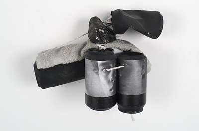
The Chosen Cans
Paul Lee goes for great eschatological themes: love and the body. The TD crew usually frowns on sentimentialism, but the formal rigor dignifies this show of collages and assemblages, art forms based on joinery - on coupling.
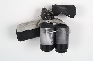
His materials include soda cans, washcloths, twine, lightbulbs, coal, and photocopied images. In the philistine, mundane real world, each of these objects can expect an uninspired, brief life of being produced, being consumed, and being discarded. They have no agency, only a passive role in a cycle of drudgery.
Paul Lee resuscitates them, The Chosen Trash, saving them from their predetermined path of banality, and recycling - resurrecting - them as art objects. Though revitalized, the cans are painted only black or white, ascetic and undecorative colors. These flat, opaque colors obscure the cans' marketing labels and previous content. Now empty, they are no longer vessels auxiliary to their contents. Absolved of these burdens, they stand freely as objects, purified and independent of a mercantile purpose, which fades into a vestigious trait.

The cans and bulbs flaunt rigid, consistent geometry and smooth, unfettered surfaces. But they are challenged by the sagging, eccentric washcloths with unpredictable textures. We think of the body, with its strong parts and vulnerable parts, clean parts and dirty. Through Lee's transfiguring hands, these refigured figures are odd dolls, soft and hard, fragmented but unified, sturdy but delicate.
Transfigured, the cans no longer have design, but now anatomy. Cylindrical, they are phallic and ostentatious. But the prominent hole at one end is an orifice, either an entry or an exit. It is also a window into a hidden, unadvertised world. Some are dented, a clever pun on the word "crush," but more poignantly, this expresses damage, injury, or dysfunction. Finally, the black-and-white pictures of faces pasted on the cans are anonymous. They aren't recognizable or distinct people, just males. It adds gender to the figures without adding personality - although the inherent melancholy is undeniable.


A wall of washcloths takes on issues in painting, similar to Tuttle's experiments in eliminating frames, stretcher bars, rectangular shape, and balanced display. But Lee surpasses this formal project to comment on relationships. First, each cloth, like each can, previously lived an uninspired life. It cleaned and occasionally was cleaned. It may have even joined its owner on a trip to the bathhouse, ostensibly for hygiene.

Second, each "cloth painting" is made from two halves spliced together from other cloths. They cling together, splayed open on the wall by gravity. We think of Felix Gonzales-Torres' Perfect Lovers, the parallel mirrors next to each other, or the analog clocks ticking away; and Apollodorus' explanation in Plato's Symposium: love is the result of a person finding his or her estranged other half. And Aristotle: "Love is composed of a single soul inhabiting two bodies."

His materials include soda cans, washcloths, twine, lightbulbs, coal, and photocopied images. In the philistine, mundane real world, each of these objects can expect an uninspired, brief life of being produced, being consumed, and being discarded. They have no agency, only a passive role in a cycle of drudgery.
Paul Lee resuscitates them, The Chosen Trash, saving them from their predetermined path of banality, and recycling - resurrecting - them as art objects. Though revitalized, the cans are painted only black or white, ascetic and undecorative colors. These flat, opaque colors obscure the cans' marketing labels and previous content. Now empty, they are no longer vessels auxiliary to their contents. Absolved of these burdens, they stand freely as objects, purified and independent of a mercantile purpose, which fades into a vestigious trait.

The cans and bulbs flaunt rigid, consistent geometry and smooth, unfettered surfaces. But they are challenged by the sagging, eccentric washcloths with unpredictable textures. We think of the body, with its strong parts and vulnerable parts, clean parts and dirty. Through Lee's transfiguring hands, these refigured figures are odd dolls, soft and hard, fragmented but unified, sturdy but delicate.
Transfigured, the cans no longer have design, but now anatomy. Cylindrical, they are phallic and ostentatious. But the prominent hole at one end is an orifice, either an entry or an exit. It is also a window into a hidden, unadvertised world. Some are dented, a clever pun on the word "crush," but more poignantly, this expresses damage, injury, or dysfunction. Finally, the black-and-white pictures of faces pasted on the cans are anonymous. They aren't recognizable or distinct people, just males. It adds gender to the figures without adding personality - although the inherent melancholy is undeniable.


A wall of washcloths takes on issues in painting, similar to Tuttle's experiments in eliminating frames, stretcher bars, rectangular shape, and balanced display. But Lee surpasses this formal project to comment on relationships. First, each cloth, like each can, previously lived an uninspired life. It cleaned and occasionally was cleaned. It may have even joined its owner on a trip to the bathhouse, ostensibly for hygiene.


Second, each "cloth painting" is made from two halves spliced together from other cloths. They cling together, splayed open on the wall by gravity. We think of Felix Gonzales-Torres' Perfect Lovers, the parallel mirrors next to each other, or the analog clocks ticking away; and Apollodorus' explanation in Plato's Symposium: love is the result of a person finding his or her estranged other half. And Aristotle: "Love is composed of a single soul inhabiting two bodies."

Friday, December 08, 2006
Cheyney follow-up

Oh, and it turns out that Cheyney Thompson has risen to such great heights in popularity that he appears not only in Lucy McKenzie's drawings, but even in a Vonage ad.

Tuesday, December 05, 2006
Grainy Cheyney

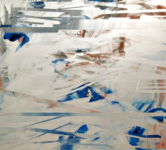
We remember a loft party where Cheyney Thompson and Pieter Schoolwerth were DJs, spinning goth and darkwave obscurities and less-danceable singles from Bauhaus and Siouxsie and the Banshees. Despite the murky music, partiers still danced when they heard even the slightest beat. This proved a relativity of danceability. Just as a monochrome painting attunes us to the subtlest of color modulations, an all-goth DJ set sensitizes us to detect traces of rhythm and vitality.
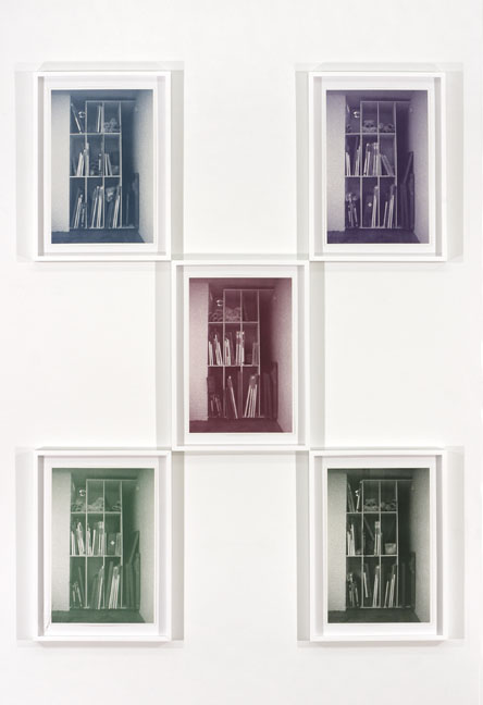
Cheyney Thompson's new show at Kreps stumped the brave TD crew. On unprimed canvas, pointillist grisaille paintings towered over us. Stepping back to look at the paintings, we bumped into a table, one in a series of gray-scale tables. Contemplating that tables have become a Thompson trope, we followed the line of tables to their destination at the back of the gallery: the storage space. This storage space is "documented" in framed, grainy prints of almost-the-same-photos reduced into CMYK separations and installed in permutated clusters where each pseudo-unique image gets a chance to be C, M, Y, or K.

Reproduction seems to be a central concern here, and not just a method. Rodin cast and recast his figures to make group scenes. Rauschenberg's "Factum," where he painted an identical twin of an existing painting, is an example. Ann Craven's practice, defined by repainting her old paintings, follows this. Cheyney Thompson offers paintings, prints, and tables as fields in which he uncovers the hair-thin differences that occur in reproduction. The paintings contain blips and ticks that occur on photocopy machines. The tables differ only in their value of gray. And the prints of the storage space are identical, except with slight replacements of the stored objects depicted. We can also treat the storage space is a nod to the ideas "stored" in Cheyney's brain, from which he retrieves themes and materials used in previous shows. Storage spaces are in the air - did you see Sarah Oppenheimer's recent show at PPOW?

Gray is a color, but its lack of chroma equals neutrality. This makes it anonymous, reclusive, and ambivalent. Gerhard Richter showed us how gray is, like, negatively connotative, meaning that its neutrality can describe/depict/report something without bias or judgement. Cheyney uses gray to strip painting of its prize properties: design, drawing, and color. The xeroxed sources seem arbitrary and random, which precludes the calculation and regulation of design. And although the images hint at form and space, no lines or washes are present to document a drawing process. The pointillist daubs of paint were presumably applied by hand, but they are more mechanical than human.

The pointillist dots connect to the pixellated prints via the dot/pixel/point. According to the press release, Cheyney's prints "also partake in values and terms which could be said to belong to painting, i.e., composition and color. If the prints have internalized the problems of painting, then the paintings in this exhibition have absorbed printing protocols." But color is a tricky game, because color is relative. Nothing is yellow, but rather "more yellow than..." or "less yellow than...". And since Cheyney reduces the prints to their CMYK components, each component piece is, at best, a monochrome; and otherwise, just a mere part of a color, a "subcolor," passive and dependent, rather than a color itself.
Discourse about the hierarchy within painting of design, drawing, and color used to polarize the French Academy into factions. Despite the contemporaneity of Cheyney's methods, he's joining arguments that are almost 200 years old - which is fine with us.

Back to the press release: it reproduces the one used in a recent show in Germany. We thought, "What, New York doesn't deserve its own Cheyney Thompson press release?!" Indignant, frustrated, we kicked the book shelf - "Don't be a dick, Cheyney!" - and brought our thinking caps tumbling down from their top-shelf perch. Then it occurred to us: if a premise of the show is the problem of originality in the face of reproducibility, then why not reproduce the entire show's press release?
Sunday, December 03, 2006
Britney In Dialogue

Britney Spears, in an unprecedented, Nauman-esque application of her own body as art object, recently and heroically thrust herself into a history-spanning dialogue about nudity, vulnerability, and physiological processes. Does her beaver shot provocatively essentialize and reduce the female body to a single organ? Or is this seeming reduction actually an editing process to focus a celebration on localized anatomy, and via vaginal apotheosis, an elevation of womanhood?
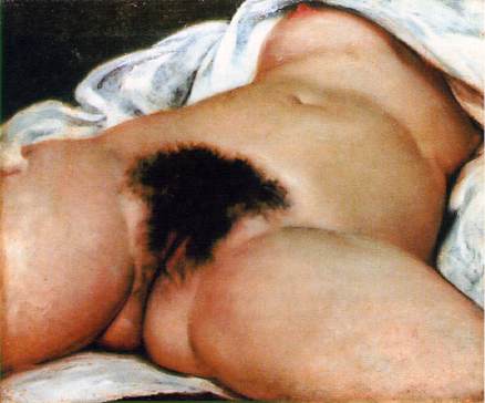
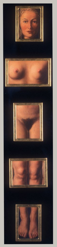
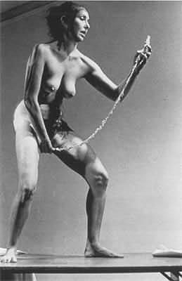
Courbet surpassed his predecessors in frankly and bluntly presenting in a fine art context the distinctly female vagina. Others have followed: Magritte, Valie Export, Carolee Schneeman, John Currin, and countless others. However, Britney surpasses all, in a staggering, simultaneous projection of self coupled with appearance of disinterest; the latter functioning in a successful attempt to deny narcissisisism.

Moreover, Britney offers a new dimension of Rosalind Krauss' famous "expanded field." Eschewing an expansion of the object to architectural space, Britney expands to popular media, filling blogs and publications with her performance. But beyond this formal innovation, Britney also makes an existential proposal and contribution to identity art. "All the world's a stage," she surely thinks as she pushes the performative space into the shared public. We are always performing!
This is all, no doubt, a series of conceptual strategies, and not accidental or a case of overindulgence. Britney is underrecognized and it's time to reevaluate her outpuss - er, output.
Friday, December 01, 2006
Factory Grrr
Gay Pearce plays a good guy, as in "Priscilla, Queen of the Desert," but he is a lousy Warhol. Way too dashing and angular, and too forward in manner. Warhol was more into mumbling and awkward gestures, with a pinkish, bulbous nose and bad skin. We know, we've seen footage and we prefer him for all those traits.
Bowie did it better.
Factory Girl Trailer
Bowie did it better.
Factory Girl Trailer
![]()