Tuesday, December 05, 2006
Grainy Cheyney

We remember a loft party where Cheyney Thompson and Pieter Schoolwerth were DJs, spinning goth and darkwave obscurities and less-danceable singles from Bauhaus and Siouxsie and the Banshees. Despite the murky music, partiers still danced when they heard even the slightest beat. This proved a relativity of danceability. Just as a monochrome painting attunes us to the subtlest of color modulations, an all-goth DJ set sensitizes us to detect traces of rhythm and vitality.
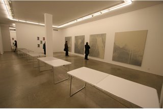
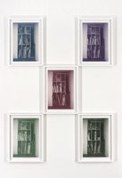
Cheyney Thompson's new show at Kreps stumped the brave TD crew. On unprimed canvas, pointillist grisaille paintings towered over us. Stepping back to look at the paintings, we bumped into a table, one in a series of gray-scale tables. Contemplating that tables have become a Thompson trope, we followed the line of tables to their destination at the back of the gallery: the storage space. This storage space is "documented" in framed, grainy prints of almost-the-same-photos reduced into CMYK separations and installed in permutated clusters where each pseudo-unique image gets a chance to be C, M, Y, or K.

Reproduction seems to be a central concern here, and not just a method. Rodin cast and recast his figures to make group scenes. Rauschenberg's "Factum," where he painted an identical twin of an existing painting, is an example. Ann Craven's practice, defined by repainting her old paintings, follows this. Cheyney Thompson offers paintings, prints, and tables as fields in which he uncovers the hair-thin differences that occur in reproduction. The paintings contain blips and ticks that occur on photocopy machines. The tables differ only in their value of gray. And the prints of the storage space are identical, except with slight replacements of the stored objects depicted. We can also treat the storage space is a nod to the ideas "stored" in Cheyney's brain, from which he retrieves themes and materials used in previous shows. Storage spaces are in the air - did you see Sarah Oppenheimer's recent show at PPOW?

Gray is a color, but its lack of chroma equals neutrality. This makes it anonymous, reclusive, and ambivalent. Gerhard Richter showed us how gray is, like, negatively connotative, meaning that its neutrality can describe/depict/report something without bias or judgement. Cheyney uses gray to strip painting of its prize properties: design, drawing, and color. The xeroxed sources seem arbitrary and random, which precludes the calculation and regulation of design. And although the images hint at form and space, no lines or washes are present to document a drawing process. The pointillist daubs of paint were presumably applied by hand, but they are more mechanical than human.

The pointillist dots connect to the pixellated prints via the dot/pixel/point. According to the press release, Cheyney's prints "also partake in values and terms which could be said to belong to painting, i.e., composition and color. If the prints have internalized the problems of painting, then the paintings in this exhibition have absorbed printing protocols." But color is a tricky game, because color is relative. Nothing is yellow, but rather "more yellow than..." or "less yellow than...". And since Cheyney reduces the prints to their CMYK components, each component piece is, at best, a monochrome; and otherwise, just a mere part of a color, a "subcolor," passive and dependent, rather than a color itself.


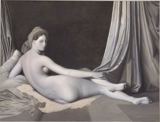
Discourse about the hierarchy within painting of design, drawing, and color used to polarize the French Academy into factions. Despite the contemporaneity of Cheyney's methods, he's joining arguments that are almost 200 years old - which is fine with us.

Back to the press release: it reproduces the one used in a recent show in Germany. We thought, "What, New York doesn't deserve its own Cheyney Thompson press release?!" Indignant, frustrated, we kicked the book shelf - "Don't be a dick, Cheyney!" - and brought our thinking caps tumbling down from their top-shelf perch. Then it occurred to us: if a premise of the show is the problem of originality in the face of reproducibility, then why not reproduce the entire show's press release?
Comments:
<< Home
I worked at a silkscreen place. They had this swedish/norwegian? presses called Svecia or Methuselah something.
Everyhing in printing silkscreens is upsidedown and backwards, so the spatio-cognitive thing is important. Also, its a positive into a negative and back into a positive. It really kind of blows your mind - especially if you CLEAN THE SCREENS too. SOlvents.
Over on paitners its silver paint - i used paint suspended in Xylol for a while - dries fast or "volatilely".
Volatility.
What is the ideal viewing distance for these? Im guessing the sweet spot is 3 feet. You knowe hi-fi.
Also - photoshop is awesome for color variation, but I dont know too much about halftoning - thats why I was shooting the screens rather than making the images.
Oh and they had this thing where if a client got unecessarily picky they would say "well make it 2% hotter/cooler". Dont let them get away with that.
Well, in a previous show, he scattered dozens of small paintings on a wall but they all shared the same vanishing point. But a big assemblage on the floor kept the viewer from standing in the ideal viewing space, according the the x and z coordinates. That's pretty clever, although we love it when the Met hangs a painting really high so viewers can't get up close. Institutional critique.
Post a Comment
<< Home

